Surface Haptic Control Knob
Introduction
Haptic Experience Design
TanvasTouch is an extremely flexible asset for user experience design. It represents an entirely new software-defined interaction layer that provides localized tactile feedback to the user’s fingertip. Like any user interaction technology, TanvasTouch surface haptics must be designed with intention if they are to be both practical and pleasing.
TanvasTouch is particularly valuable for touchscreen controls. When carefully designed, control interfaces enabled with TanvasTouch provide clear advantages to user interaction. These include:
- Increased Available Attention – Reduced visual and conscious attention needed for interaction.
- Enhanced Performance – Higher accuracy, less confusion, and faster speed of operation.
- A Premium Feel – Increase user satisfaction and confidence due to tactile aesthetics.
These advantages exist because TanvasTouch technology solves two specific classes of tactile feedback problems on touchscreens:
- Locating: Finding tactile features on an otherwise featureless surface
- Operating: Dynamic adjustment of a parameter through user motion


This guide describes how to take advantage of TanvasTouch’s surface haptic feedback to solve real world feedback problems and deliver an overall excellent user experience in the context of a surface haptic control knob.
Haptic Control Knob Overview
Design Reference and Source Code
This documentation provides a reference design for a TanvasTouch rotary knob. It explains the design intent and diagrams the fine details of the interaction. This knob was developed for the context of a glanceable touchscreen display, such as those found in automotive dashboards, or audio control surfaces, however, the design principles generalize to other touchscreen control interactions.
Follow along with the tutorial below, and see how it is implemented by viewing the source code included with the TanvasTouch SDK. If you have installed the TanvasTouch SDK 2.0.1 or greater, the default folder for viewing the source code is C:\Program Files\TanvasTouch SDK\API\.NET\examples\hapticknobwpf.
User Goal and Context
The overall goal of the user in this example is to adjust the value of a knob in a context of limited or distracted user vision. This scenario is common in areas such as automobile dashboards or recording studio control panels.
In these cases, primary attention and conscious thought is focused elsewhere, such as on the road or the musician, and audible feedback is typically not desired. The knob interaction, therefore, was designed to be silent and to enable users to navigate through the entire interaction cycle with only brief glances and minimal conscious attention.
The overall user goal of adjusting the value of a control knob can be broken down into multiple subgoals, or actions. The user completes these actions by visually and haptically engaging with control elements and by moving between control states. The definition of these elements, states, and actions are outlined below.
Control Elements
The control knob is made out of a number of dynamic control elements. These elements are embodied by graphics and surface haptics which change and respond to the user. These elements are:
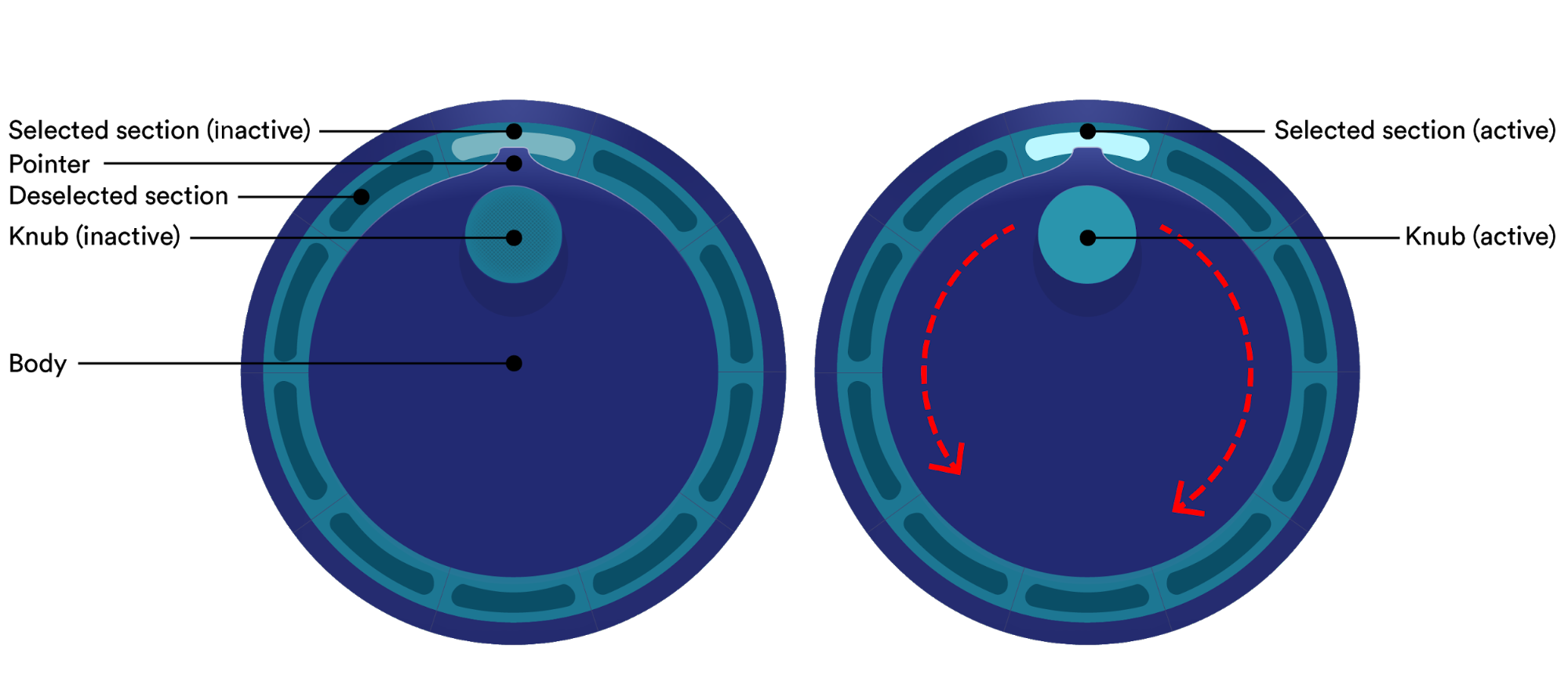
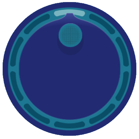
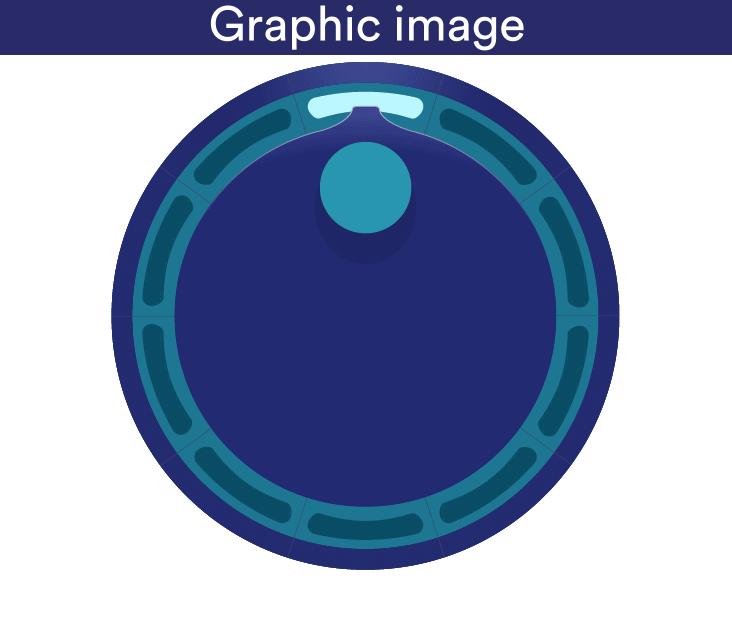
The “Knub”
The “knub” is the main interaction point for the user. It can be thought of as the handle. This is where users must touch to activate and what they must rotate to adjust. The knub, along with the pointer, indicates which section is highlighted.
The Body
The body is the central circular portion of the knob. The knub is at a fixed position on the knob body, and both rotate together as the user moves their finger.
The Sections
The sections indicate the values that the knob can adjust to. In this example, there are 10 discrete sections. These sections are generic and could represent different things depending on the application, such as numbers, modes of operation, volume level, or anything else that needs to be selected or adjusted.
The Pointer
The pointer indicates the orientation of the knob body, and is used to show when the knob will transition between sections. It always points to the highlighted section.
Control States & User Actions
The main interaction cycle of the knob consists of two distinct states (active or inactive) and the user performs actions to navigate both within and between them. The user’s possible actions are determined by the current state they are in.
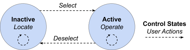

At any point in time the user can either continue to remain in a given state, or transition into the other state of the knob. By chaining clear user actions and transitions between states together, users are able to confidently operate the knob from start to finish and reach their overall goal.
Inactive
The default state of the knob is inactive. The current highlighted section is shown, as well as the location of the knub. The highlighted section cannot be adjusted while inactive, and the knob does not respond to user movement.
In the inactive state, possible user actions are:
- Locate and orient to the knub control point
- Select the knob, transitioning to the active state

Active
While active, the knob is able to be rotated by the user, and the highlighted section can be adjusted.
In the active state, possible user actions are:
- Operate the knob, changing the highlighted section
- Deselect the knob, transitioning to the inactive state

User Walkthrough
To explain how the knob has been designed to facilitate glanceable interaction, it’s useful to walk through the entire interaction cycle, giving detail along the way.
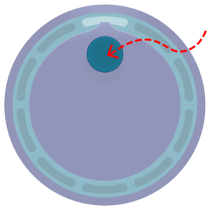
Locating the Knub
Beginning from the default inactive state, the user’s first action is to orient to the control knub, which is highlighted both visually and haptically. A quick glance is used to locate the general area, while surface haptics is used to give detailed feedback that allows the user to use their fine motor skills to precisely locate the knub. This mimics the way humans naturally feel for things they aren’t paying visual attention to. The user can slide their finger across the knub to get a sense of the center of the knub, and are then ready for selection.
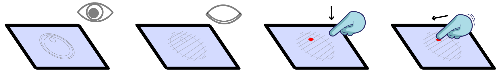

Selecting the Knob
Selection of the knob can be a bit tricky, as the user may not be staring directly at the knub after haptically locating it. Therefore, selection is done by the user explicitly placing their finger down within the knub area. This means that even if the user slides across the knub and locates the center, they must additionally lift their finger and place it back down on the knub in order to transition to the active state. This selection method avoids unintentional selection and adjustment during the locating phase of the interaction cycle.
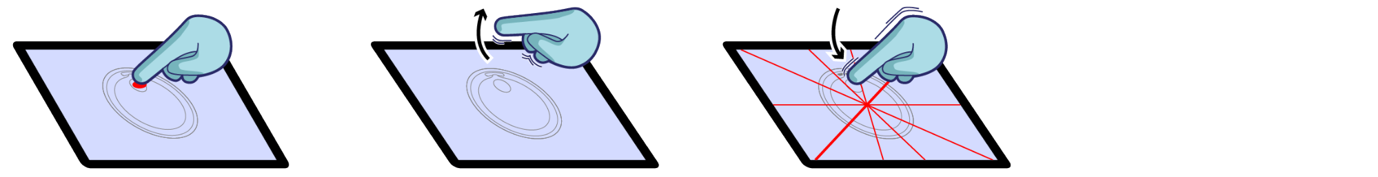

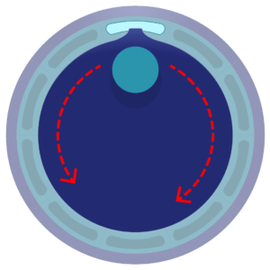
Operating the Knob
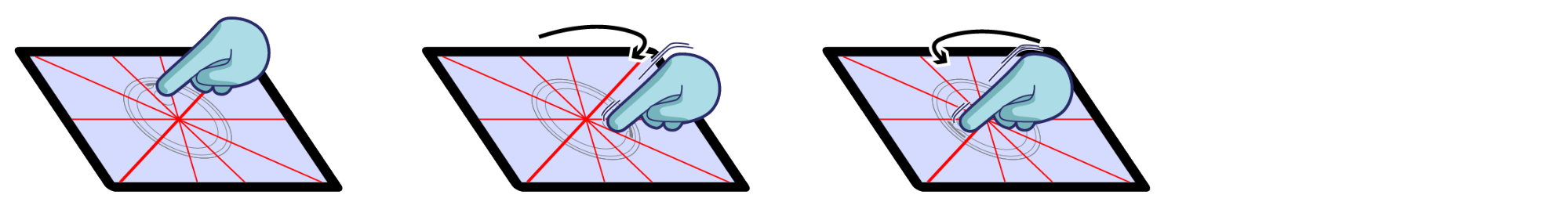
With the knob selected, the knob body is locked to the angular position of their finger with respect to the knob center. Users can move clockwise or counter-clockwise, freely rotating the knob. Importantly, when the pointer crosses the transition between two adjacent sections, a new section will be highlighted the old section will fade out. The user receives both tactile and visual feedback when this transition happens, and therefore does not need to continuously visually attend to the screen.
This cycle of adjustment happens over and over again as the user rotates around the knob’s center. Even if they move closer to or further from the center, the user still receives the correct feedback each time a new section is highlighted. The operating cycle ends when the user is satisfied with their adjustment.

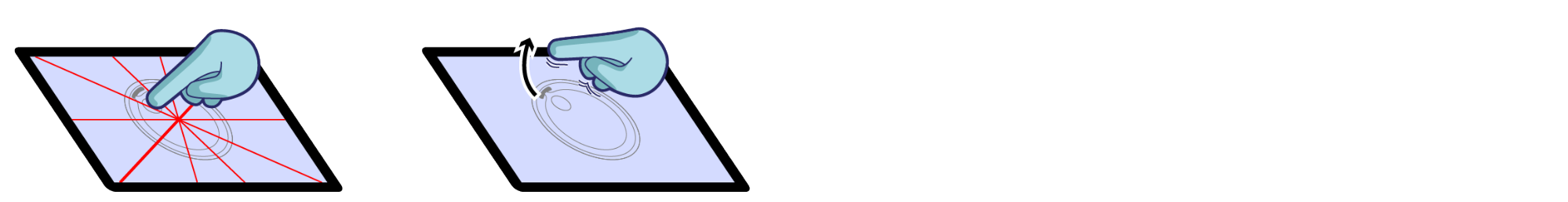
Deselecting the Knob
To deselect the knob, the user simply has to lift their finger from the surface. This touch-up event is meant to be the opposite of the touch-down event which initially selected the knob. After deselection, the body of the knob centers on the last highlighted section. Operating haptic effects are disabled, and the locating haptic effects are enabled and centered on the new knub location. This completes the entire interaction cycle, and resets the knob for the next time the user wishes to adjust it.

Effects Design
This section details how and why the graphic and surface haptic effects were designed.
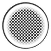
Inactive Graphics
Graphically, the knub is designed to signify that it can be grabbed or acquired. It is an appropriate size for a finger to rest on (1cm), and it has a slight visual texture overlayed on top. This sets the user’s expectation of feeling a textured surface haptic area. A minimal shadow is given to the knub to indicate three dimensionality, and it is a contrasting color from the knob body.

Inactive Haptics
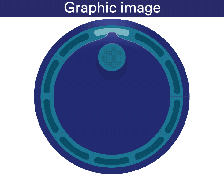
Haptically, the intent was to keep the effect simple and clear. Sliding their finger over the knub, users feel a strong texture that stands out. In fact, no other haptic effects are rendered on screen. This means that if they feel a texture, they can be sure they are on the knob knub.

To create the haptic image, a strong grid type texture was masked with a white circle that is slightly larger than the actual control knub graphic. The white area around the outside provides a sharply contrasted edge with the background and the textured area provides strong region based feedback.
Because they are both pixel-based, combining and synchronizing haptics and graphics is simple with the TanvasTouch API. The positions and sizes can be shared between graphic and haptic images, and can be updated together. For example, each time the user deactivates the knub, the haptic image position simply needs to be updated to match and to be centered with the graphic image. With the two effects overlapped, there is a strong sense of a textured, physical knub actually located on the surface of the touchscreen.
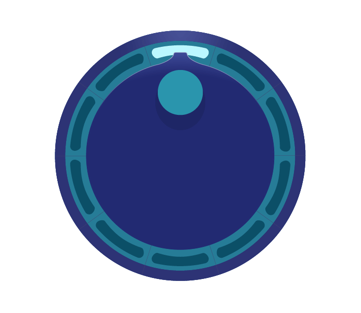
Active Graphics
The graphics during active mode emphasize motion and transition. The knub loses its visual texture, and smoothly rotates with the finger. When the knob pointer leaves one section, there is a subtle fade out effect. When it enters the next section, there is an instantaneous “on” effect. These visuals prime the user for tactile effects.

Active Haptics
The active surface haptics are simple and effective. White lines of high friction and medium width (~1mm) mark the end of one section and the beginning of the next. Using full black and white haptic values (0-255) and a crisp, instantaneous transition from low to high friction leads to strong, unambiguous perception. This is heightened by the fact that feedback only exists at precise transition points. This means if the user feels a tactile tick, they can be sure it was a transition.


The effect is also large enough so that even if the user strays from the circular path of the knub, they still are operating and receiving feedback at the correct angle. Both the rotation animation and haptic image remain active as long as the user is touching the screen and moving.
Summary
To summarize, TanvasTouch hardware and software makes it easy to implement common UI elements, such as a control knob, that can be used with little to no visual attention by the user.
Additionally, it does so in a way that is intuitive, and mimics the way that humans naturally interact with the real world. Effects are easy to create, and the software API makes them easy to implement.